Case Study : Let's Talk Interactive
A new identity and a new website for a telemedicine software company.
Overview
Let’s Talk Interactive (LTI) is a software company specializing in custom solutions for the telemedicine/telehealth industry. Their mission is simply to provide technology solutions that help providers offer access to quality healthcare coverage – regardless of local service levels.
Although LTI has been around for years, they’ve been operating as a startup for quite sometime. That means they’ve also encountered the same problem so many startups have: growing fast with a lagging or underdeveloped brand.
- Client
- Let's Talk Interactive
- Project Type
- Logo & company website
- Services
- Visual branding, website UX/UI design
- Year
- 2019
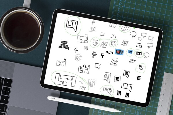
Logo concepts
LTI had two or three different logos that were in use, none of which really captured the essence of the company’s mission or what they do. Multiple logos meant no standard color palette, no standard fonts, no brand standards. That all added up to an inconsistent brand.
The objectives for the new logo were simple: it needed to be unambiguous and straightforward.
As always is the case with design, the process started with sketches. Various ideas were put down on paper (and tablet, as it were) to see if any of them were viable enough to push further.
Logo design
Those sketches were worked and refined into four concept directions to potentially go in. After discussion and some back and forth, we were left with two similar concepts to choose from.
The winner was chosen for four fundamental reasons: simplicity, scalability, boldness, and compactness.
With some detailed cleaning up of the final artwork, LTI was provided with various formats of the new logo, along with basic logo guidelines.
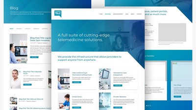
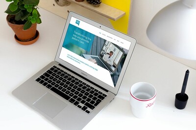
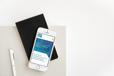
Website goals
Overdue for a refresh, let alone a redesign, the previous iteration of their site used a basic, uninspiring layout derived from the framework it was built on. The two keys to the redesign were to build on the visual brand we had just completed to give more consistency, and to create a layout that Let’s Talk Interactive could adapt and mold to their content needs while still being unique and impactful.
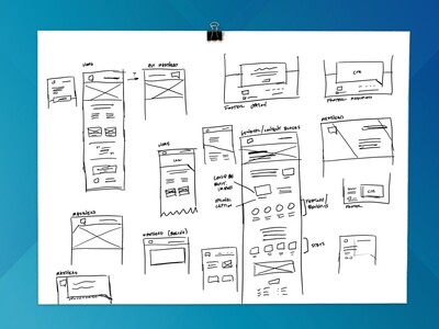
Wireframes
We were fortunate in that LTI gave Block 81 the freedom to do what we thought best and simply keep them in the loop. So while the overall design process didn’t change, some phases took less time. Wireframing was one of those phases.
Our wireframing phase typically starts with wireframe sketching, or wireframe thumbnails. These are crude layout ideas for various pages of the site (especially the home page) that allow for fast ideation and iteration. Typically from these we create full-fledged wireframes, but for LTI it wasn’t necessary. This was in part because of the relatively short timeline and in part due to the strongest idea becoming so clear so quickly.
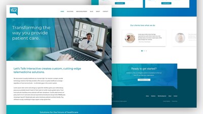
UI design
Using the new logo and logo guidelines as the foundation for the site’s design, those thumbnail wireframes turned into full-fledged mockups that were created, iterated, and refined in roughly forty hours of work.
One of the key aspects of the design was to provide flexibility so that a page could hold a variety of “content blocks”. The reason for this was based on knowing that the site would grow as LTI started to write more content and make headlines.
Results
Completed at the right time – just before the COVID-19 pandemic really took hold – the new logo and the website design gave Let's Talk Interactive a solid branding foundation to build on and grow beyond the startup phase.