Case Study : OEA Great Public Schools
We took one of OEA's microsites and expanded it within the same Craft CMS setup.
Overview
Back in 2018/2019, Block 81 redesigned and rebuilt the Oregon Education Association website. When we did that, three microsites were included. One of those was for Greater Public Schools, which provides on-going education for educators. Since the initial launch the GPS microsite outgrew itself and needed to become a more traditional website.
- Client
- Oregon Education Association
- Project Type
- Organization Subsite
- Services
- UX/UI design, Craft CMS development
- Year
- 2021
Goals
User experience
With more and more varied content being added, it was important to make the site easier to find information.
Structure
In order meet the first goal, organizing the existing content as well as new content types was critical.
Design differntiation
While we needed to stay within the overall OEA brand, it was important that the design was different than the other microsites to create differentiation.
Site map and wireframes
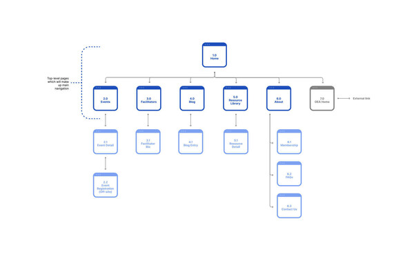
To tackle the first two goals we needed to dive into the existing microsite’s content. A lot of the hard work was done beforehand by the GPS lead – they laid out the content they had and what they wanted to keep, move, or get rid of. That made it easy to pick up from there and start with a site map – a visual of the high-level organization of the new site. The site map then helped us to determine if the content organization made sense and whether it was going to make things easier for users overall.
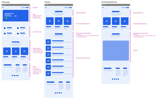
We knew that a site map wasn’t going to be enough, so we also created low fidelity wireframes. Going with low-fi was on purpose – it allowed all involved to keep our focus on the hierarchy of key content on each page within each section. The wireframes weren’t necessarily representative of the layout but rather the main content types and page flow. This type of wireframing keeps things a step or two more detailed than the site map without getting into too much detail.
Design
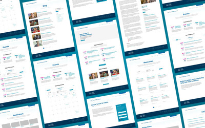
The third goal of the site, as mentioned previously, was to create a similar design that was in line with the OEA brand and similar to that of the main OEA site but not a mirror. That meant a minimal and information focused UI and a lot more dynamic content. It also meant it needed to be easy for users, especially when it came to the events section.
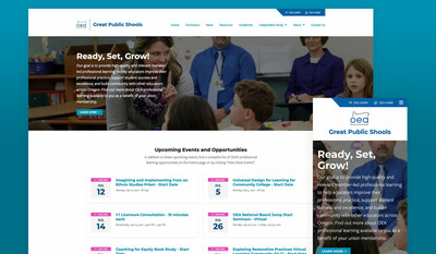
What we came up with for the overall look and feel is a blend of aspects from OEA and Today’s OEA (the organization’s magazine site). The somewhat minimalist design is meant to really highlight the information and present as few distractions as possible. We made the events be the primary focus on the home page and expanded the blog with the introduction of topic categories.
The overall point was to keep the UI dead simple – simplicity was key: no fluff, no bells, no whistles; just a focus on the content. This site is informational in nature and that’s what we focused on.
Code
The site was already on Craft CMS as a microsite which shared some content channels and fields with the other two microsites. So we had turn the GPS site into its own, somewhat self-contained mini-site in the same Craft setup. Fortunately this went pretty smoothly thanks to our solid organization when we first built the OEA website. All we needed to do was add a few more sections and several fields.


Results
The professional education arm of OEA ended up with an improved website that allowed them to add and manage content in a much more efficient way. This has made it far easier for them to present and send information on events and professional learning opportunities for educators across Oregon.