Responsive Form iframes & Seamless.js
Using third-party form services like Typeform, Jotform, Hubspot, or Pardot for your website is not uncommon and generally is pretty easy to embed code without worrying how it will display on various devices. Except for Pardot. It’s 2023 and Pardot has not made their iframes responsive. Here's how to solve that.
Clients who are savvy marketers or have a marketer or marketing team at their disposal will often use a third-party platform for web forms. Using services like Typeform, Jotform, Hubspot, or Pardot is not uncommon. And for the most part these services not only make it easy to add a form to any page on your website, the embed code they provide will typically account for various device sizes and browser resizing in particular. Except for Pardot. It’s 2023 and Pardot has not made their iframes responsive. Apparently it’s a long-standing issue. 🤦♀️
Why is this an issue?
iframes are great for embedding content from other sites onto yours when needed. But <iframe> is an HTML tag that’s been around longer than mobile devices and, for whatever reason, it has just never caught up to responsive web design. When you embed a form, for example, you can set the width and height attributes in the iframe tag like so:
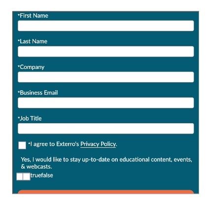
<iframe width="500" height="1000" src="...">The problem is that those attributes are fixed sizes, which is what Pardot provides in their embed code with no other accompanying code or internals to resize the iframe so all of the embedded page’s content will show. So what will happen is that the content inside is longer/taller than the containing element, creating the need for a scrollbar inside the <iframe>. That results in the forms having scrollbars on certain devices and screen sizes, even if you change the height attribute. Here’s an example from a recent project:
So what’s developer to do?
Use seamless.js
Seamless.js is a JavaScript library (with no dependencies) that makes working with iframes easy by doing all the seamless stuff for you automatically.
Using seamless.js is pretty easy and requires two JavaScript files:
- One for the site or page you’ll be the iframe on (the parent page),
- and one for the page that is in the iframe (the child page).
The one caveat to this, as you may have figured out already, is that you have to have access to the page that the iframe is referencing. If you don’t, there’s really no way to solve this. If you’re using Pardot though, this won’t be a problem.
The first step in getting seamless.js to work is to add the following code to your Pardot layout template (i.e. the child page):
<script src="https://cdn.jsdelivr.net/npm/seamless@1.4.1/build/seamless.child.min.js"></script>
<script type="text/javascript">

  // Connect to the parent page.
  window.seamless.connect();
</script>
The next step is to add the other half of the Seamless code onto your webpage (i.e. the parent page):
<script src="https://cdn.jsdelivr.net/npm/seamless@1.4.1/build/seamless.parent.js"></script>

<script type="text/javascript">
  window.onload = function () {
    // Turns the iframe into a seamless iframe.
    window.seamless(document.getElementById("your-form-id"));
  };
</script>

<iframe
  id="your-form-id"
  src="[your-partdot-form-url"
  width="100%"
  scrolling="no"
></iframe>
The key to the above code is to make sure your iframe has an id attribute and reference it in the JavaScript. Be sure to put your Pardot form URL in the src attribute.
Once everything is in place, your form will display without any height issues on any device!