Setting Up Clients for Success with Craft CMS
Putting careful thought into what we hand over to clients makes a world of difference. Here's how to do that with Craft CMS.
Craft is arguably one of the best CMS platforms available today. And maybe if you’re reading this, you likely agree. From its user-friendly interface to the customizability of content authoring to the vast array of plugins available to extend Craft, it is an elegant workhorse that, in my experience, clients truly enjoy.
That all said, for clients to really be successful with Craft, it needs a little TLC from developers. Not because it isn’t intuitive and well organized out of the box (it is!), but because putting in a little more thought into what we hand over to clients makes a world of difference. More specifically, it’s up to us as developers to provide the extra details and elbow grease to make Craft even better for our clients. I think there are three key ingredients to this:
- Planning - making sure you know what’s involved
- UI tweaks - cleaning up the UI for efficiency and understanding
- Education - teaching your clients how to use Craft
Planning
Planning the site well before a single line of code is written is critical for the overall project’s success, but also for the other two ingredients listed above. In my experience, this comes in the UX or information architecture phase and, for us, it sometimes encompasses two key documents:
- Site flow or site map
- Content outline
Site flow document
For the past handful of years at Block 81 we’ve been providing a site flow document. I call it “site flow” because it’s sometimes a mashup of a site map and low fidelity wireframes. Other times, it’s still one document, but separates the site map and the wireframes. The whole point in either case though is to link the two together, basically as one deliverable. Why? I’ve found that this helps clients see both the high-level view (the site map) and the slightly more detailed view (the wireframes).
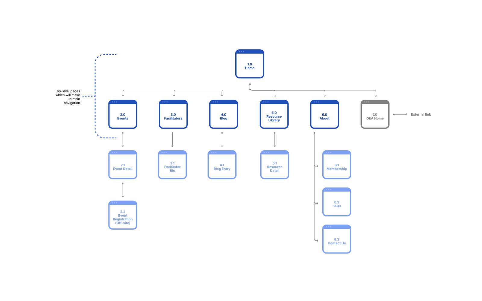
The above is a relatively typical site map that demonstrates the overall site structure and organization.


The two screens above are more of a site map and wireframe hybrid. Each page or screen is numerically labeled in an outline fashion (1.0, 2.0, 2.1, etc) to demonstrate the structure and relationship between screens. And each screen then shows the different components or blocks that the page will hold.
For developers it helps us start to plan out how we’re going to set things up in Craft. This also has the advantage of helping clients down the road if we keep the general organization in mind.
Content outline
Between you, me, and anyone else reading this, I don’t always provide a Content Outline. It’s hard to put a definitive rule on when to include or not include a Content Outline. For smaller or simpler sites it can be overkill and a Site Flow document is enough. For larger sites that are going to go through a major reorganization or are going to have a ton of content added, a Content Outline document can be super helpful for everyone on the project.
In recent years I’ve mainly used the Site Flow document that incorporates the key aspects of a Content Outline. Here’s one such example:

The site map in the above screenshot is one page in a larger IA (information architecture) document that included wireframes for key pages. I annotated the site map to provide just enough info on each major section of the site. For this particular project, this was the right approach; it gave the client the info they needed and internally we made notes on URLs and redirects based on the approved site map. Not all projects follow this exact model or style but this is the best example I could share.
I’ve had the occasional larger project where more detail is needed, even (or especially) for the client. As mentioned previously, those projects tend to be larger and more content heavy or they’re going through a major restructuring. Below are two examples.
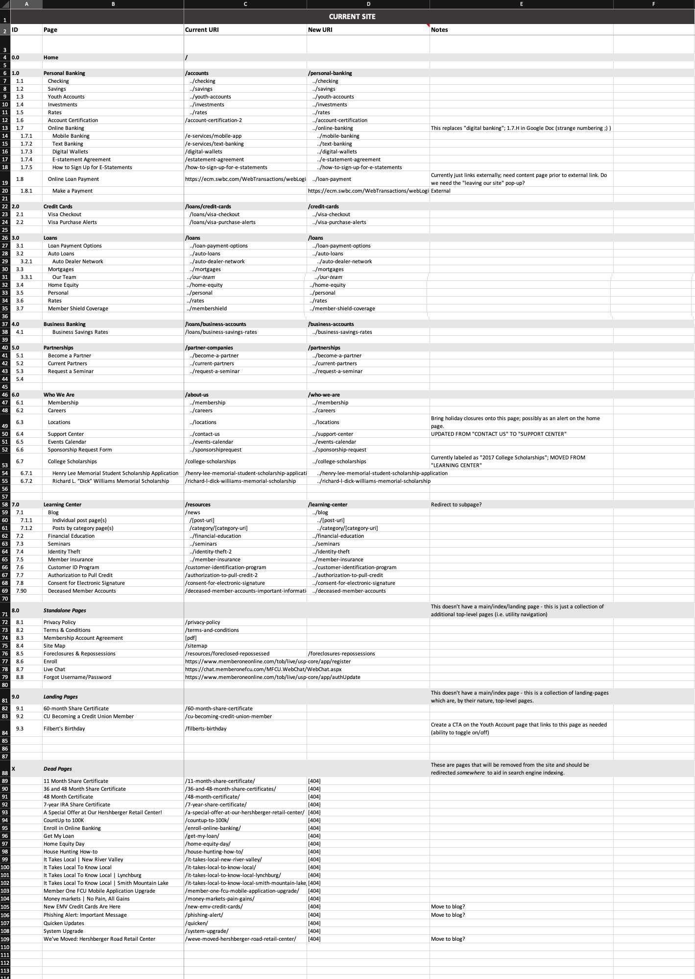
This first screenshot is of an Excel document for a credit union redesign we did back in 2018. It lists the pages of the existing site and their URIs in the second and third columns, with the first column showing our numbering system. The fourth column shows the new URI for for each page, if the page was going to be kept. The fifth column is for notes that we used as needed. We worked closely with the project lead on the client side so that we could effectively discuss and plan what needed to happen with every single piece of content which was far easier with this Content Outline.
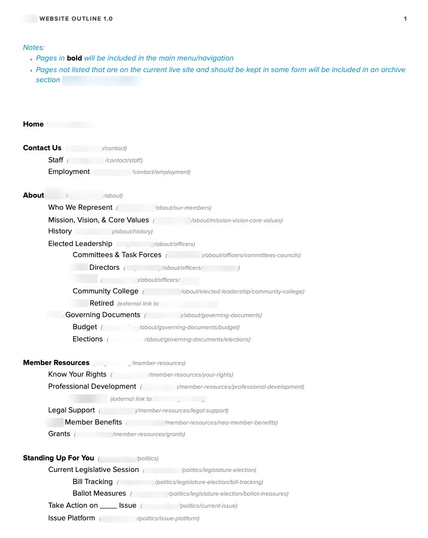
This second screenshot below is from a PDF and is a simple outline of pages for the site. Each page is accompanied by a URL so that it was clear and obvious how the site’s pages would be organized in Craft. We did attempt a more detailed version as shown in the first example, but that proved to be a bit confusing for certain folks, so we simplified to this outline. It lead to better understanding and a much more successful project.
UI tweaks
Craft’s control panel UI is really good. Like, really good. But there are things that you can tweak in the control panel to make things easier to understand and lessen whatever small amount of friction some of the UI could potentially cause clients (especially those that are new to Craft).
User permissions
There are a lot of settings and configurations inside Craft, even with no or a couple of plugins. But 99% of the time, there’s little to no reason for clients to see these settings. At best, it can get confusing and just add clutter or too much information. At worst, a client may inadvertently change a setting that ends up drastically changing things on their site in a way that is not good. So it’s always a good idea to limit permissions to what they need the most: manage content.
Control panel customizations
With sites I’ve “inherited” I’ve sometimes seen Craft’s control panel colors completely changed. Often times it’s purely for branding reasons. While the idea isn’t bad, I think it’s better to just leave Craft’s control panel colors alone. It’s pointless if it’s for purely aesthetic reasons and nine times out of ten it will work against Craft’s built-in accessibility.
Field instructions
Craft provides the ability to create any kind of field you need for managing content. It’s one of its superpowers. Along with each field is the option to add instructions. From what I’ve seen, these often get severely underused. My guess is that some developers don’t think about it or just assume that the field name is intuitive enough. But what may seem intuitive to us as developers while we’re building a site may not be so intuitive to the marketing team who just wants to add some content. Using the field instructions is critical as users enter and manage content. They serve as reminders of what the content should be, how it should be formatted, etc.
UI tabs
With the ability to add as many fields as needed for any given entry type, sometimes – especially with longer and more customized pages – having a lot of fields on one screen can be very overwhelming. Craft gives us UI tabs that can work incredibly well for breaking up fields to be less overwhelming.
UI elements
Sometimes UI tabs are overkill, but there still needs to be some separation of fields, at least visually to help declutter the entry page. In those cases – and for other reasons – I’ll often use UI elements, which were added in Craft 3.5.
Training/education
As alluded to earlier, out of the box Craft is incredibly well designed which makes it pretty intuitive to use. But with every tool there’s a certain learning curve. How steep that curve is depends on how familiar a person is with the tool. For clients new to Craft, it can take some time to get accustomed to it, especially if they’re not especially web savvy. But that’s okay! We as developers, designers, or project managers should make even a small effort to teach clients how to use Craft effectively.
There are three main formats that CMS training can take: in-person training, text-based docs, and video.
In-person training
For me, this used to literally be in person – I’d head over to a client’s place of business, pull out my laptop and show them how to use the CMS. Eventually that turned into doing a video call (like Zoom). And not just as of 2020 – I started doing that with certain clients where it just wasn’t feasible to drive out to their office for one reason or another.
Pros:
- Great for building rapport with clients.
- Allows you to answer questions immediately.
Cons:
- Clients that don’t use the CMS frequently may forget how to do things.
- If a particular person leaves the company and doesn’t provide a how-to, you may have to train the next person.
- If a new feature is added to the site, you’ll need to train on that too.
Text based documentation
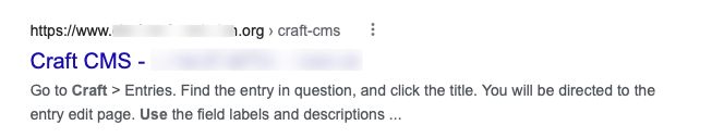
This is pretty straightforward - just write up instructions on how to use the CMS. This can be in virtually any text-based format: PDF, HTML, crayon… whatever. The key is to put the documentation in a place that’s easy for clients to remember and that won’t get picked up by search engines. Yes, I’ve actually seen this in Google:
Pros:
- Readily available for the client.
- Relatively easy to update if new features are added.
Cons:
- Clients may not read them (it happens).
- They can take time to write. While templates help, each site you build is probably going to be unique so you’ll still have to take the time to write out key pieces.
Video training
A great alternative to writing documentation and having in-person trainings is video. Simple and straightforward videos on how to use Craft can be quite beneficial. Assuming people watch them.
Pros:
- Clients can see what you’re referring to.
- Videos can be rewatched as needed.
Cons:
- Can be time consuming
- Difficult to update.
My preference: a hybrid
In my years of using various CMS platforms, I’ve done all of the above. But nothing ever felt just right. The closest I got was recording a live training with a client and providing them with the recording. Not long after that it dawned on me that that was actually super helpful to them. And so began my hybrid approach of text and video.
I have a Notion template that I start with that goes over the general things that apply to every single Craft setup—logging in and out, managing users, managing assets, SEO etc. The areas I customize are specific to each site, such as the different places to manage content. Depending on the site and other factors, these areas are usually documented in video format.
For the video(s), I make sure to create an outline of what I need to go over. I don’t really create a script though because when it comes to these kinds of instructional videos, I always go off script. 😆 I don’t know why. I’m sure they’d benefit from a script, but instead, I try to go slow and be super intentional about what I’m highlighting.
Pros:
- Using a template and something like Notion, along with keeping videos for the custom areas of the Craft setup, you save quite a bit of time.
- It’s easily updatable. Even if you need add a feature, you can just write out the instructions or record a short video.
- If you still want to do in-person training, it can serve as a great guide.
- It gives clients a little bit of personalization.
Cons:
- Videos will still take time to create.
Conclusion
While I wrote this with a focus on Craft CMS, the truth is, the general idea of taking that time to make content management a bit easier can—and should—apply to other CMS platforms as well. It puts you in a good light in terms of service and the value your client is getting. But far more important to that, you’re actually helping your client be successful with their website. This is invaluable and can easily make or break the experience someone has with a CMS. I’ve seen examples of clients hating this or that CMS and most of the time the issues really boiled down to some combination of not being familiar with the system and the system not being optimized for their use case. Both of those things can be addressed by us as developers. If we truly want our clients to succeed, providing them with a good authoring experience is a part of that.