Your Logo Needs a Visual System to Thrive
Unlock your brand's full potential with a comprehensive visual system. Elevate beyond just a logo to foster recognition and trust among consumers.
Logos stand as iconic symbols representing companies, products, and services across the globe. They serve as the visual cornerstone of a brand's identity, encapsulating its essence and values into a single mark. Yet, while logos hold undeniable power in shaping brand perception, their impact is only fully realized when they’re integrated into a cohesive visual system.
James Martin, a graphic designer I admire a great deal, touched on this not too long ago on Instagram: “A logo is only as powerful as the visual system it lives in.” He expands further:
A logo needs to be backed up with colours, typography, illustrations and a full visual system for it to become a powerful asset to a client.
Everyone is different and everyone needs a separate set of assets!
…a visual identity is much more than a logo, it’s a whole design system for communicating.
That alone is why you, as a business owner or marketing manager, should expect more than just a logo or a basic logo guide when engaging with freelancers or small design studios. And it’s also why I’m often surprised when a client tells me they have no visual system or the one they were given by their logo designer leaves out important elements and information.
The importance of a visual system
Before I get any further, I should note that I’m using the term “visual system” to encompass the various types of guidelines that are created by designers and agencies, from a logo style guide to a visual brand guide to a full brand identity system. No matter how comprehensive, at its core, a visual system is made up of a diverse array of elements and guidelines that together shape a brand's visual identity. While a logo serves as the foundation of this system, it’s just one piece of the proverbial brand puzzle.
The importance of a visual system lies in its ability to extend the reach and impact of you brand through cohesion and consistency. By establishing a cohesive visual language that spreads through every aspect of your brand's communication, a visual system reinforces brand recognition and fosters a sense of familiarity and trust among audiences. Whether it's through the consistent use of colors and typography in marketing materials or specific types of imagery and design elements on the web, a well-executed visual system ensures that every interaction with your brand is a reinforcing experience, strengthening its connection with consumers over time.
Color
A well thought-out color palette can reinforce the emotions you’re trying to evoke in your brand. From the vibrant red of Coca-Cola to the practical brown of UPS, colors evoke specific associations and elicit emotional responses.
Typography
Similarly, typography can also play a pivotal role in conveying tone and personality. Font/typeface choices can range from bold and assertive to elegant and refined, reflecting your brand's character and values.
Imagery
Imagery and other design elements—such as icons, patterns, and illustrations—add depth and texture to the visual narrative.
Collectively, these components form the building blocks of a visual system, giving you ways to create memorable experiences that resonate with audiences.
Examples
Although my twenty-plus years as a designer have been primarily focused on user interface design, branding is where I started and an area of design I love. In that time I’ve seen everything from beautifully crafted to terribly executed visual systems. And far too often, when I’ve asked a web design client for their brand guidelines, I’ve been told they don’t have any. 😮 In fact, it’s a couple of recent projects that spurred the idea for this article.
Here’s an example I threw together based on one of those recent projects:
Although the above example was put together for demonstration (in about 5 minutes), the real "brand guide" I saw looked very similar.
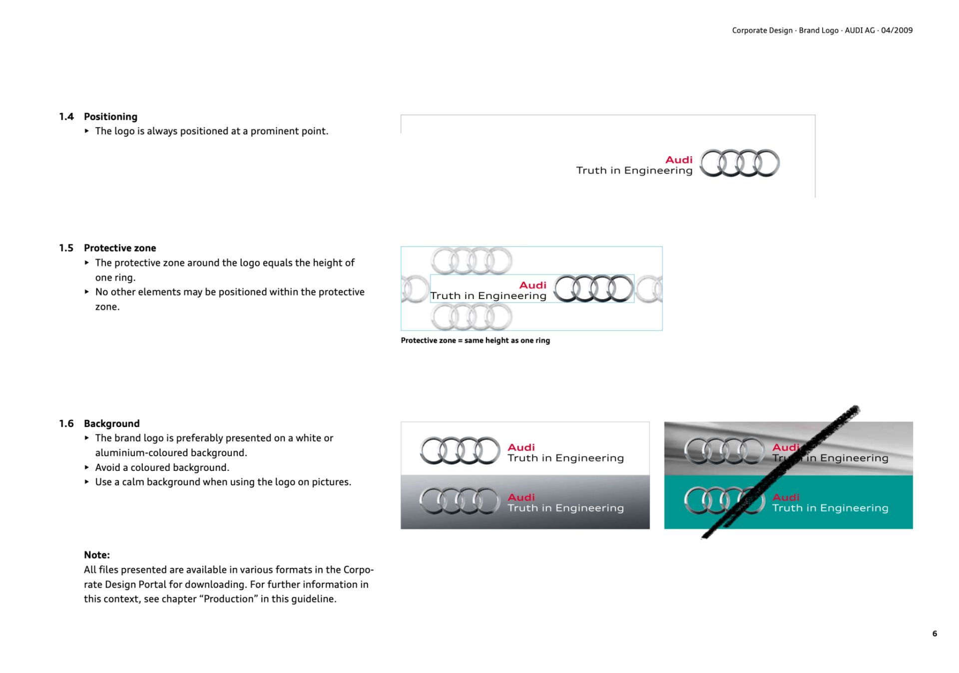
A better implementation would have included a bit more information about what clear space is and how it’s determined. Here’s a page screenshot from Oregon Education Association’s visual brand guidelines I created back in 2019 that includes that additional information:
It’s also nice to have typography guidelines if possible. Take this page from a very short and simple brand style guide for Heavy Duty Lighting that I created way back in 2016:
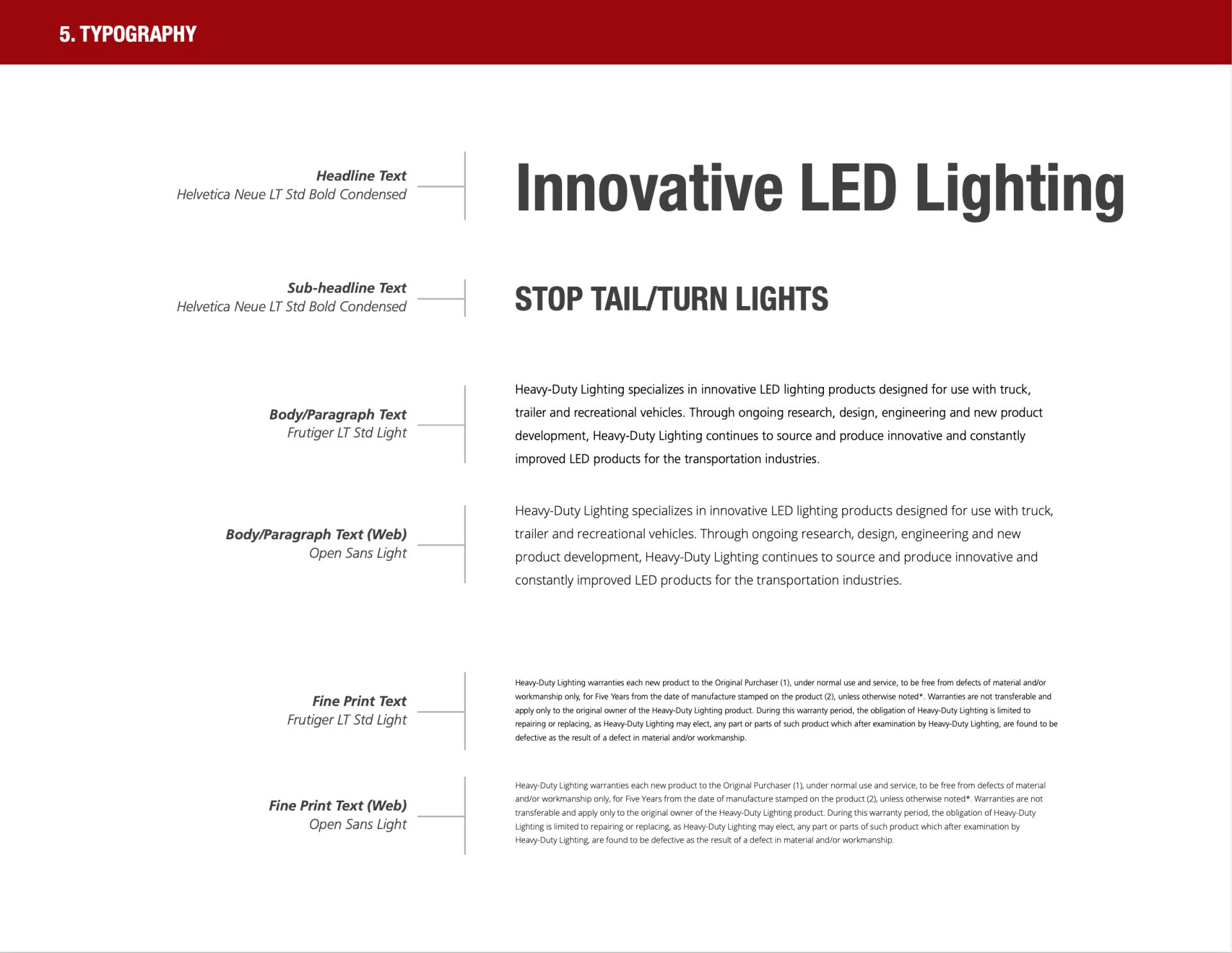
What’s outlined here are different text treatments. Although sizes aren’t included, the point is to provide a rough guide on how typography—namely headings, paragraphs, and the typefaces for each—should work for this particular brand.
Okay, so those are two examples I created. Big whoop. Here are a couple of examples from well-known brands:
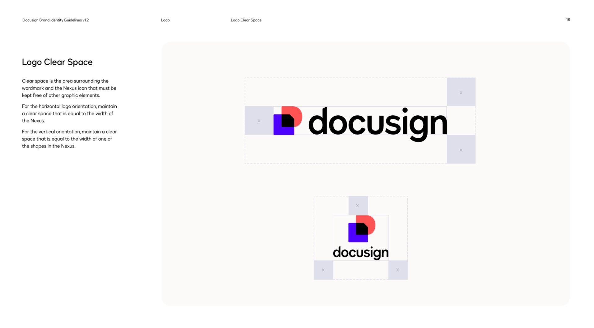
To be fair, most small and medium businesses don't have the budgets that Audi and DocuSign have. That doesn't mean we, as designers, can't give lesser known clients something more comprehensive.
From logo to visual system
Hopefully you can now see why a visual system is important. It’s why I find it such a shame when I see companies I’ve worked with get so little—if anything!—when they’ve hired a designer to create their logo. (It’s also important to note that not every client will opt for more than a logo. Still, in my opinion, it’s never a bad idea to include a basic logo guidelines document.)
Getting only a logo and little else can leave your business with a limited toolkit for brand communication and development. That may seem like a good idea as it seemingly gives your company a lot of flexibility, but often it leads to one of the things we’re working to avoid: inconsistency. Unless you have a designer or design team in-house or multiple freelancers or studios that you’ve hired, chances are you’re going to end up with a brand hodgepodge.
While a logo is very important, it represents just one piece of your brand's visual identity. Without a comprehensive visual system to guide its implementation across different mediums, you’ll end up with designs that are all over the place (i.e. they lack consistency and cohesion). This can further dilute your brand’s impact on audiences, especially if you hire different designers for different mediums.
To truly unlock the potential of your brand identity, you need to understand the value of investing in a comprehensive visual system, be it from a freelance designer or design studio. By hiring and collaborating with an experienced designer, even the smallest business can have a visual framework that is tailored to their unique needs and goals, reflects their identity, and resonates with their target audience. Moreover, freelancers and small studios often offer a more personalized and hands-on approach to project management, ensuring that you receive the attention, expertise, and creativity needed to bring your brand vision to life.
But how do you know if you’re going to get more than just a logo and an overly simplistic logo guide? Simple—ask about the process and deliverables. You should expect a comprehensive and collaborative process that goes beyond mere design execution. And you should actively participate in the decision-making process, providing feedback and insights to ensure that the final visual system reflects your organization’s vision and resonates with your audience.
In addition to delivering high-quality design assets, a visual system package should include comprehensive guidelines and documentation that empower you or future designers to effectively implement and maintain your company’s brand identity across various touch points. This can include specifications for logo usage, color palettes, typography, and imagery. Sometimes this can also include guidelines for brand messaging and tone of voice.
Conclusion
The journey from a simple logo to a comprehensive visual system is one of empowerment for any brand. Logos serve as the initial point of contact, the visual representation that encapsulates a brand's essence and values. But their true potential is unleashed when they’re integrated into a broader visual ecosystem—a comprehensive visual system that encompasses colors, typography, imagery, and design elements. This system extends the reach and impact of a brand identity, fostering consistency, recognition, and trust among consumers.
For businesses seeking to maximize the impact of their brand identity, investing in a comprehensive visual system is not just a smart choice—it's a strategic requirement. By partnering with an experienced design studio, your business can embark on a collaborative journey to develop a visual framework that aligns with your identity, resonates with your audience, and drives long-term success. With clear expectations and active participation in the design process, you can ensure you receive maximum value for their investment, equipping your organization with the tools and resources needed to elevate your brand presence and thrive in an ever-evolving marketplace.