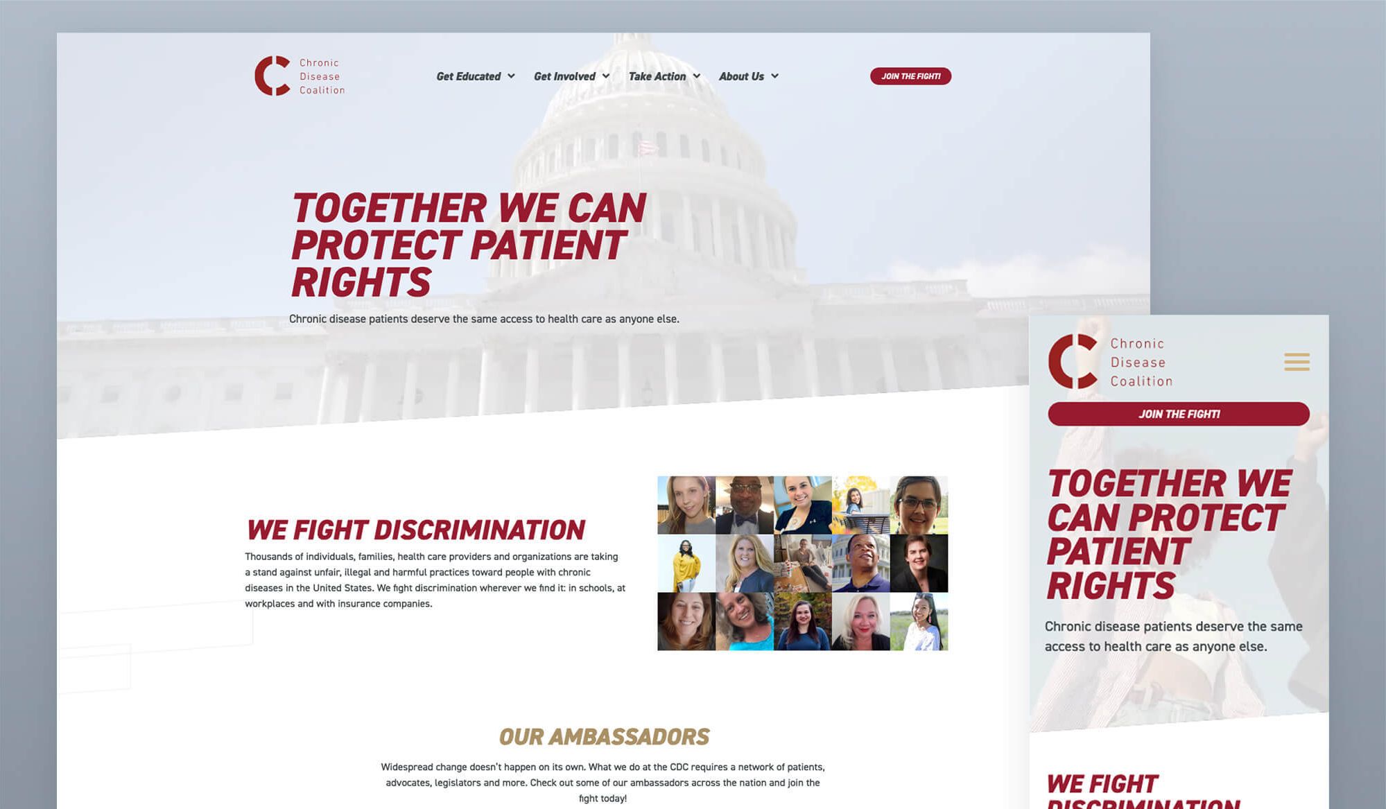
Since its inception as a small Pacific Northwest kidney advocacy group, Chronic Disease Coalition has grown to a national organization with thousands of patient advocates. Their website needed a full overhaul to better demonstrate key values and objectives and to line up better with a brand refresh. After much discussion they banked on Block 81 to help them get there.
UX design
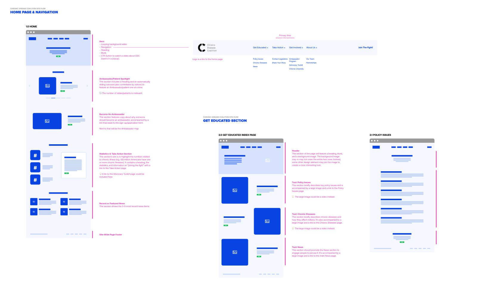
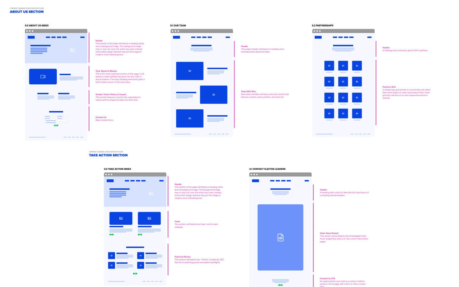
CDC is run by folks who know their stuff and were very clear about the sites goals, usage, and audience. They provided a detailed creative brief that described where they wanted the site to go conceptually that included a rough idea on the site’s content reorganization. We took that and developed iterations of site flow decks – a hybrid of a high-level site map and low-fidelity wireframes.
Our site flow decks gave CDC a really good view of the overall site as well as the content needs for the site, which we developed based on the goals and audience information in their creative brief. This resulted in critical questions being asked for not just clarification, but to ensure all bases were covered.
UI design
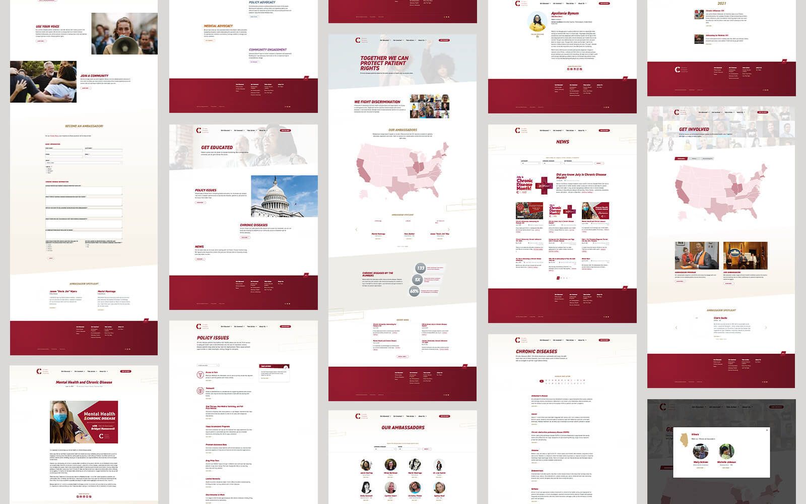
One of the important pieces of this project was to make everything more human. So when it came to the design, apart from using more storytelling imagery, we also opted for a lighter color scheme while staying in line with the CDC brand. The heart of CDC is the human aspect – the amazing people battling chronic diseases every day. We ensured to put them front and center when it made the most sense and the most impact. Additionally, the work the Chronic Disease Coalition does is rooted in action. That translated visually into boldness and forward movement which we believe we achieved through the better use of CDC’s signature red, bold and large headings, sharp angles, and clear calls to action.
CMS migration & code
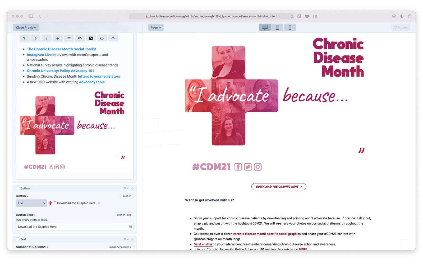
Chronic Disease Coalition’s previous site was hastily built on WordPress. Although it worked just fine, the team at CDC weren’t in love with it. Through clear discussions and understanding their needs and concerns, we agreed that a migration to Craft CMS would suit them well for one major reason: the authoring experience. Craft is a robust CMS whose authoring experience is second to none that has made adding content easy for the CDC team. Additionally, Craft allows for custom organization of content and content types that can greatly add to the authoring experience.
One of the critical pieces of this project was migrating the most critical content on the previous site: news. We’ve got a bit of experience with this so it was a relatively easy task which included moving over images and SEO tags. And working with our preferred SEO partner, we ensured the previous URLs were properly redirected to their new ones so that Google – and anyone who had bookmarked pages – would get to the right place on the new site.
The final challenge was the various maps used to show the impact of chronic disease in the US. Leveraging SVGs, we created clickable maps to convey information on CDC’s ambassadors, chronic disease policies, and the prevalence from state to state for key diseases. The best part for the CDC team is that they have the ability to manage the data that displays per state.


Putting it all together
The end result is a clear and easy to understand website that: lines up perfectly with the rest of CDC’s branding and campaign materials; is easily manageable; and puts a human touch to an ever-important topic.