Oregon Education Association (OEA) is a union that represents more than 40,000 educators working in Oregon’s public schools and community colleges. During my time in working with them to keep their website updated and working as smoothly as possible, the communications team at OEA realized the importance of a strong and utilized website presence – one that not only provides information, but inspires action.
Logo design
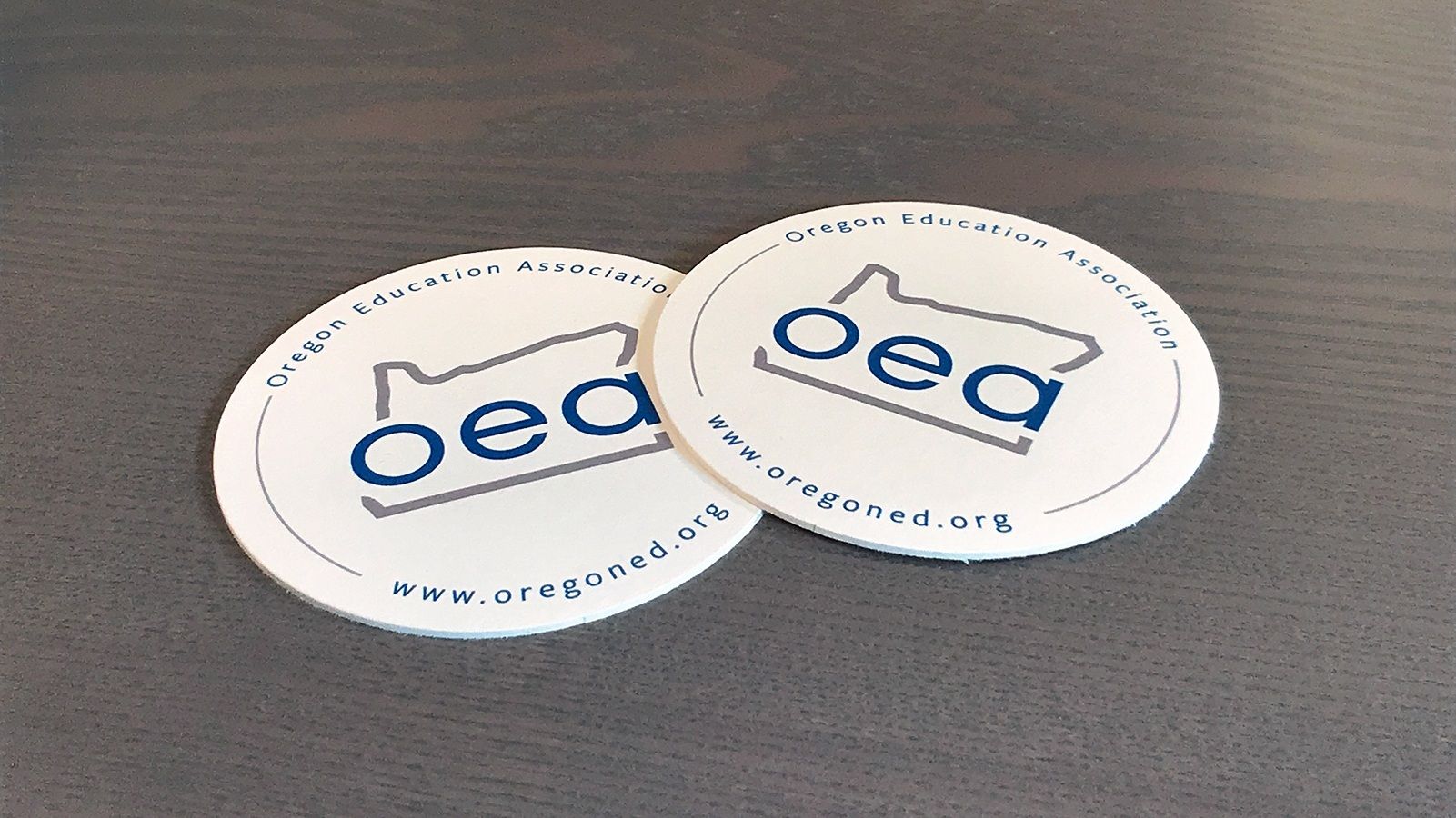
During early discussions about the project, it became clear that OEA also needed a visual brand revamp. That is, a logo redesign, coupled with solid visual brand guidelines.
The previous version of the OEA logo was a simple typographic logo. While effective, the Communications team felt it was becoming outdated and that the overall feel was a bit too serious and formal. The key to this was modernizing the logo without alienating the more conservative and older members and leadership.
Content audit, restructuring, and wireframes
The first step for this project was to thoroughly audit the website’s content. With as many pages as the site had, it was no small task that required us to collaborate and bring our respective strengths and knowledge. This meant outlining all of the pages on the websites and determining whether or not to keep them, where to put them in the new, simplified structure, and whether the URLs would change. There was a lot of back-and-forth in this stage but it resulted in a much more streamlined site structure.
With the content audit and structure set, wireframing was the next phase. It was important to keep a good flow to the structure of the various sections. Wireframing was a great way to explore options for this. It also allowed the OEA team to get a good feel for the hierarchy of content.


UI design
The fun part for me as a designer is, perhaps obviously, the design phase. It’s far more than coloring in the wireframes. It’s pushing the wireframe as far as possible without losing the integrity of the hierarchy and layout.
For OEA, the brand work we did early on drove 80% of the decisions in the design phase. The remaining 20% was figuring out the subtle details that make a website frictionless and enjoyable to use that also engage and speak to the core audiences.


Results
OEA got a welcome breath of fresh air in both their visual brand and the practicality of their website. The content reorganization has made it easier for users to find information as well as for site managers to keep it up to date.