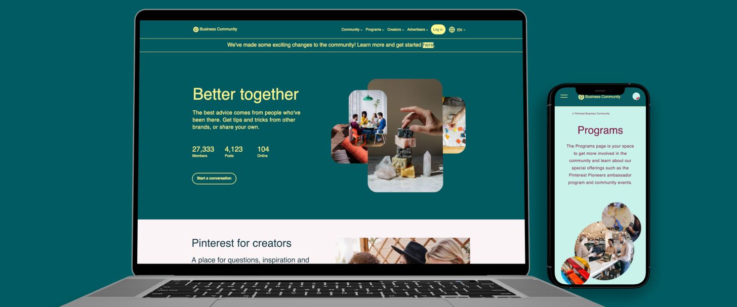
Toward the end of 2021, Pinterest was looking to scale the Business Community for 2022 by providing more offerings and live events. The community site’s infrastructure at the time wasn’t able to efficiently support such initiatives. Plus, the design itself was no longer in line with the Pinterest brand.
UX
Since the core problem wasn’t so much a software one, but a UX/UI one, Pinterest aimed to improve the latter to help make the content, resources, and offerings more accessible for new and existing community members.
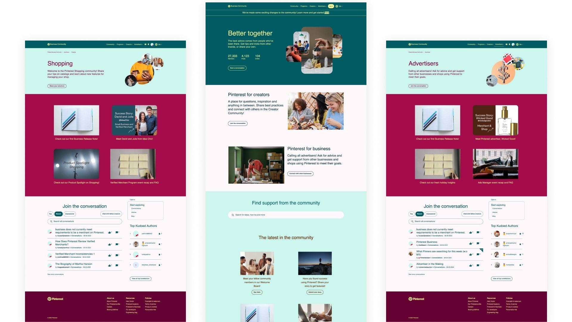
Although much of the UX was directly handled by Pinterest Business Community team, we closely collaborated with them to provide a more objective perspective. Our main contribution, however, was the actual UI design of various pages, most of which were used as templates for the online software that runs the community.
UI & process
We referred to the existing community site and other community sites the Pinterest team had highlighted as reference points and inspiration. Using our favorite UI design tool, Figma, we designed several screens that focused on presenting the content in a more “Pinteresty” way, which meant: fun, easy to read, attention grabbing, and matching the Pinterest brand.
As we worked through a number of iterations, we also worked with the Pinterest brand team to make sure we were creating design components and pages that reflected the brand while ensuring that the software team would be able to code everything out. This also meant that some rudimentary prototypes were needed to properly demonstrate certain interactions.

