What Makes a Website Mobile Friendly?
Having a mobile friendly website means optimizing your website to be compatible and readable on mobile browsers. But there's a bit more to it than that.
Newsflash: Your website has to be mobile friendly.
Full stop.
Okay, but what does that mean exactly?
It means optimizing your website to be compatible and readable on mobile browsers. Or to put it more simply… making sure that your site works and looks good regardless of the browser or device a visitor is using.
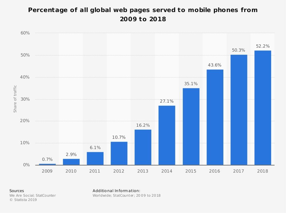
As of last year, over 50% of global web traffic came from mobile browsers. Compare that to just four years ago where mobile browsers accounted for 35% of traffic.
For businesses that have invested in making sure their websites are mobile friendly, this adds up to more opportunities for potential customers to find them. A lot more.
Okay, great. But what makes a site mobile friendly? I’m so glad you asked! Here are three key things.
Responsive web design
This is probably the most critical piece of a mobile friendly website. Responsive web design means that a site adjusts and scales with screen size, making it work well on both large screens, tablets, phones, and even TVs.
Ease of use
All sites should be easy to use – that’s a given. But on mobile, there are key things that need to be implemented properly (which vary from site to site) in order to make sure the site is easy to use within the context of a particular device. What works well when using a website on a laptop may not work well when using that same website on a smartphone.
Speed
This is a big one! That huge, yet oh-so-pretty image on your home page might load fast on your super fast internet in your office. But what if the audience you serve is primarily rural and doesn’t have the super fast internet speed you do? That large image, among plenty of other things, is going to be a serious bottleneck. While images account for most speed issues, there are other technical factors too that are often forgotten when it comes to speed and having a mobile friendly website.
Optimizing your site for any device
Optimizing your website for any device is critical if you care about providing the best possible experience for your audience. And you should care about that – not caring can mean poor lead generation and lost sales. How? A crummy experience on a website so often means someone leaving for the competitor and purchasing from them instead.
So how do you optimize your website for any device? The three things I mentioned above are high-level things that encompass various details, both from a technical or coding standpoint and a content management standpoint. While there are some basic things that can be done, each site is going to have specific needs to get it optimized properly.
In other words, it depends. But you can start by running your site through Google’s PageSpeed Insights. That will at least give you something to go on, even if you, the site owner, aren’t sure what it all means. The next step is to get assistance from a website developer who does know what the results mean and what it means to optimize a website for any device.