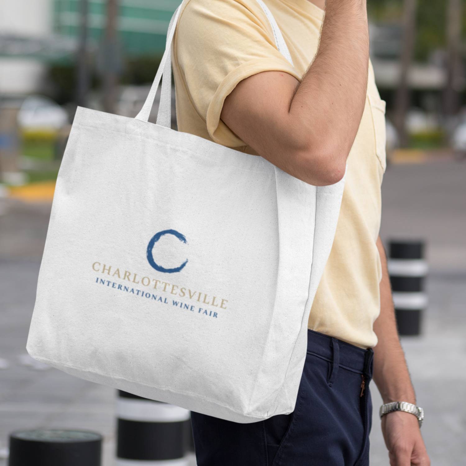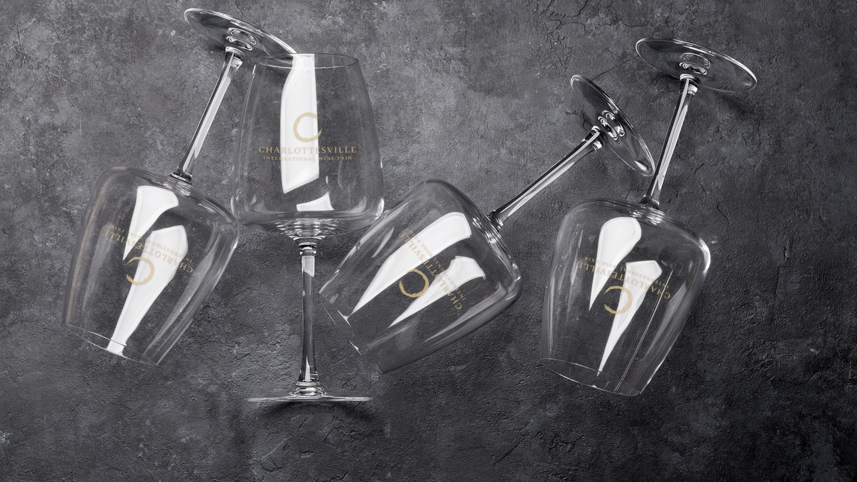
A New Wine Fair Needs a New Identity
Variant Events has been a Block 81 client for more than five years. When they started work on a new premium international wine festival in Charlottesville, VA, they asked me to create the logo for this promising venture.
Balancing Sophistication and Approachability
Creating a new logo for a brand new organization or event is always exciting and challenging. There's also a bit of nervous energy since there are so many possible directions to go in. But that's where the client's vision comes in: to help rein things in and set some parameters and constraints, which are necessary for a truly good logo. In this case, I was tasked with creating a logo that would balance sophistication with approachable elegance and stand out in a crowded Virginia wine event landscape. It needed to appeal to discerning wine enthusiasts seeking elevated, educational experiences.
Discovery & Strategy
During the initial project phases we talked to discover the following:
- Brand personality: sophisticated, expert, approachable, luxury, innovative
- Key differentiators: international focus, premium curated experience, education-driven
- Visual requirements: timeless, elegant simplicity, works across digital and print
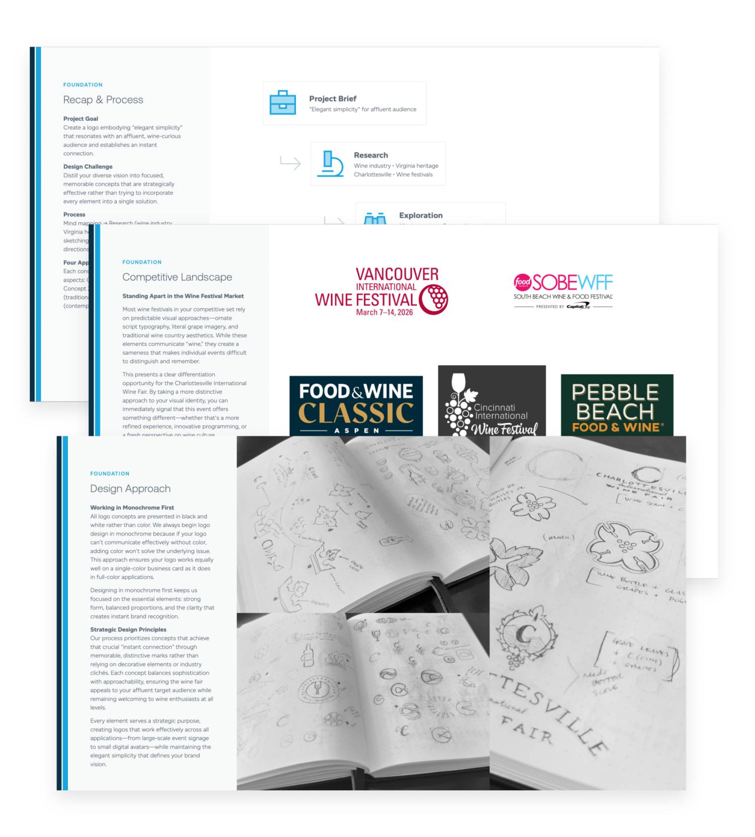
As part of this process, we also reviewed the competitive landscape to ensure I'd be creating something entirely different from other events.
Finally, I did extensive visual research to explore different depictions and design interpretations of wine, bottles, grapes, and high-end design styles and colors.

Design Process
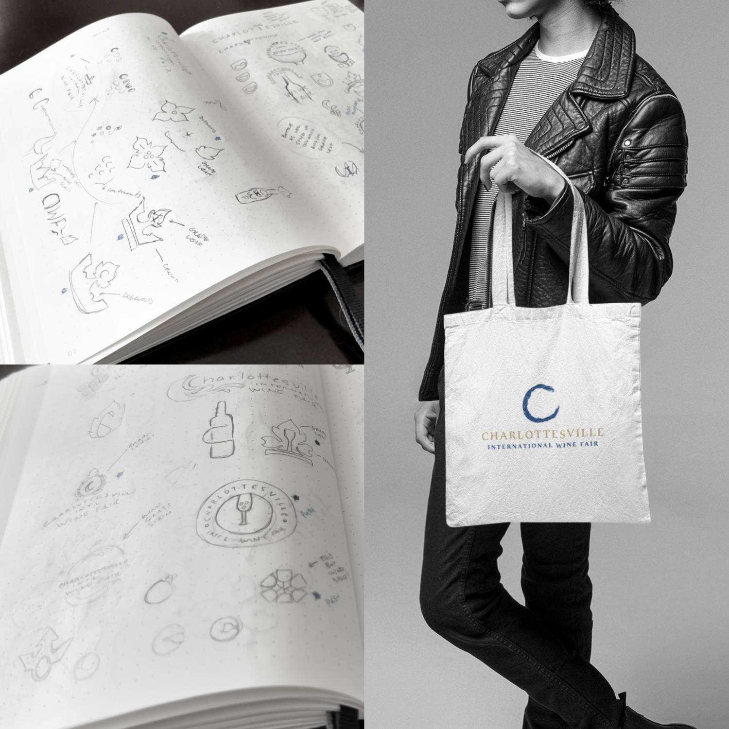
The initial exploration consisted of a lot of sketching—9 pages of pencil sketches to be exact—to explore possibilities and see what could potentially work, not just conceptually but functionally. The most promising of those initial sketches were refined further through more sketching, exploring different design element combinations and riffs on concepts.
From there I digitized the strongest concepts to test viability. After all, a logo needs to be simple, versatile, memorable, and scalable. Taking the strongest concepts into a vector design app allows me to test for that as much as possible as well as try different variations of the details.


I presented four initial concepts, each going in a slightly different direction and encompassing a different visual theme. A fifth was added at the client's request before deciding on one to develop further. All in all, we went through five rounds of presentation and progressive refinement to reach the final logo.
The Solution: Organic Excellence
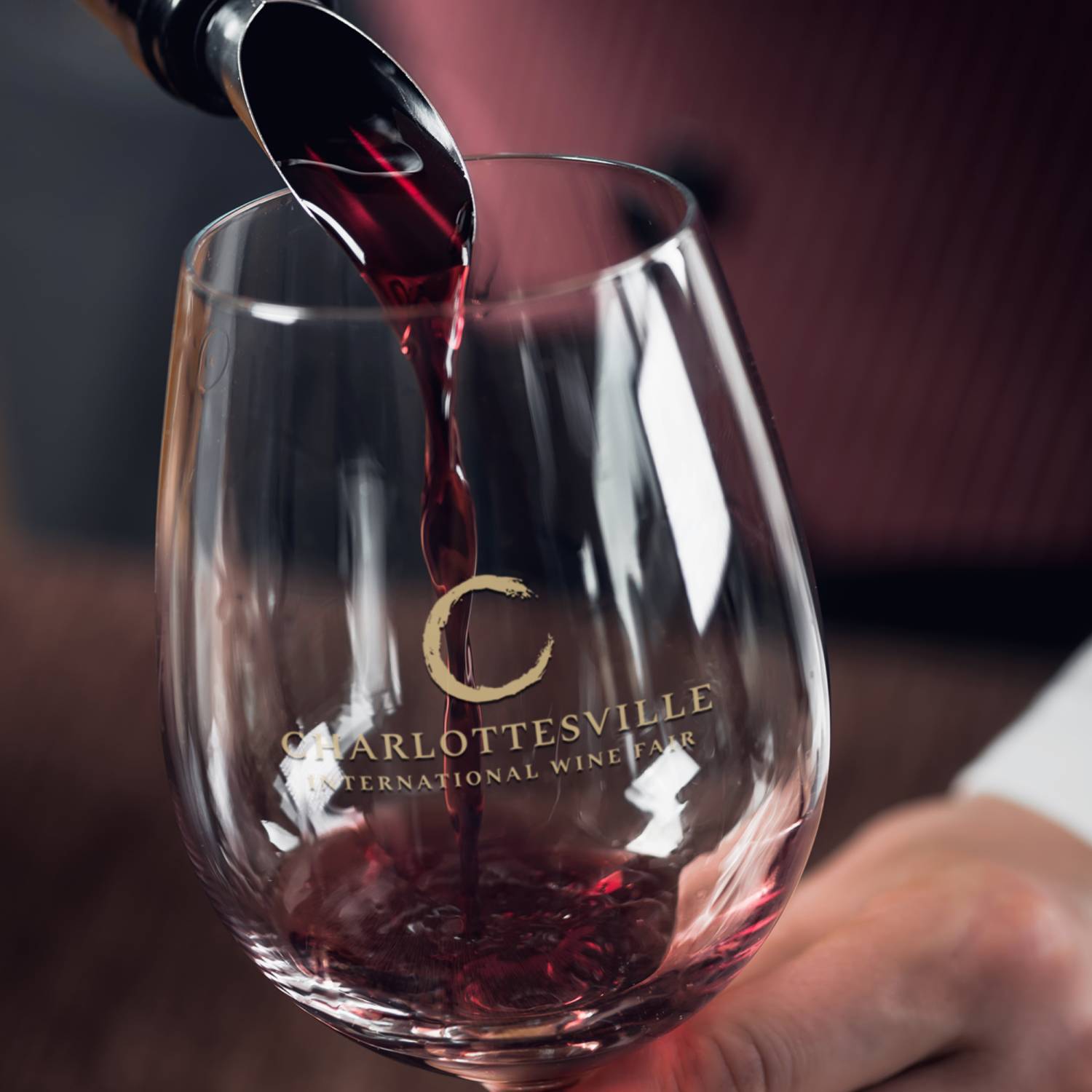
The final logo concept combines authentic wine culture with simple elegance. Wine stains are a familiar and authentic part of the wine experience. The organic shapes they create are impossible to replicate artificially, giving this mark a genuinely handcrafted quality that can't be mass-produced or copied, making it distinctive from sterile corporate logos in the same space.
The letter "C" serves double duty: it's the initial letter of Charlottesville while its curved form subtly echoes the base of a wine glass, creating an elegant typographic element.
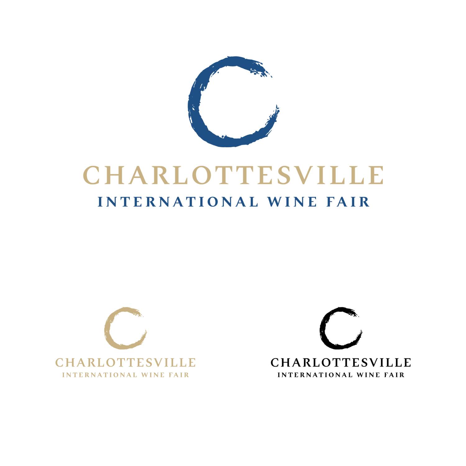
When combined, these elements create a distinctive circular mark that feels both sophisticated and grounded in the authentic wine experience—perfectly balancing the organic and elegant qualities that define this concept.
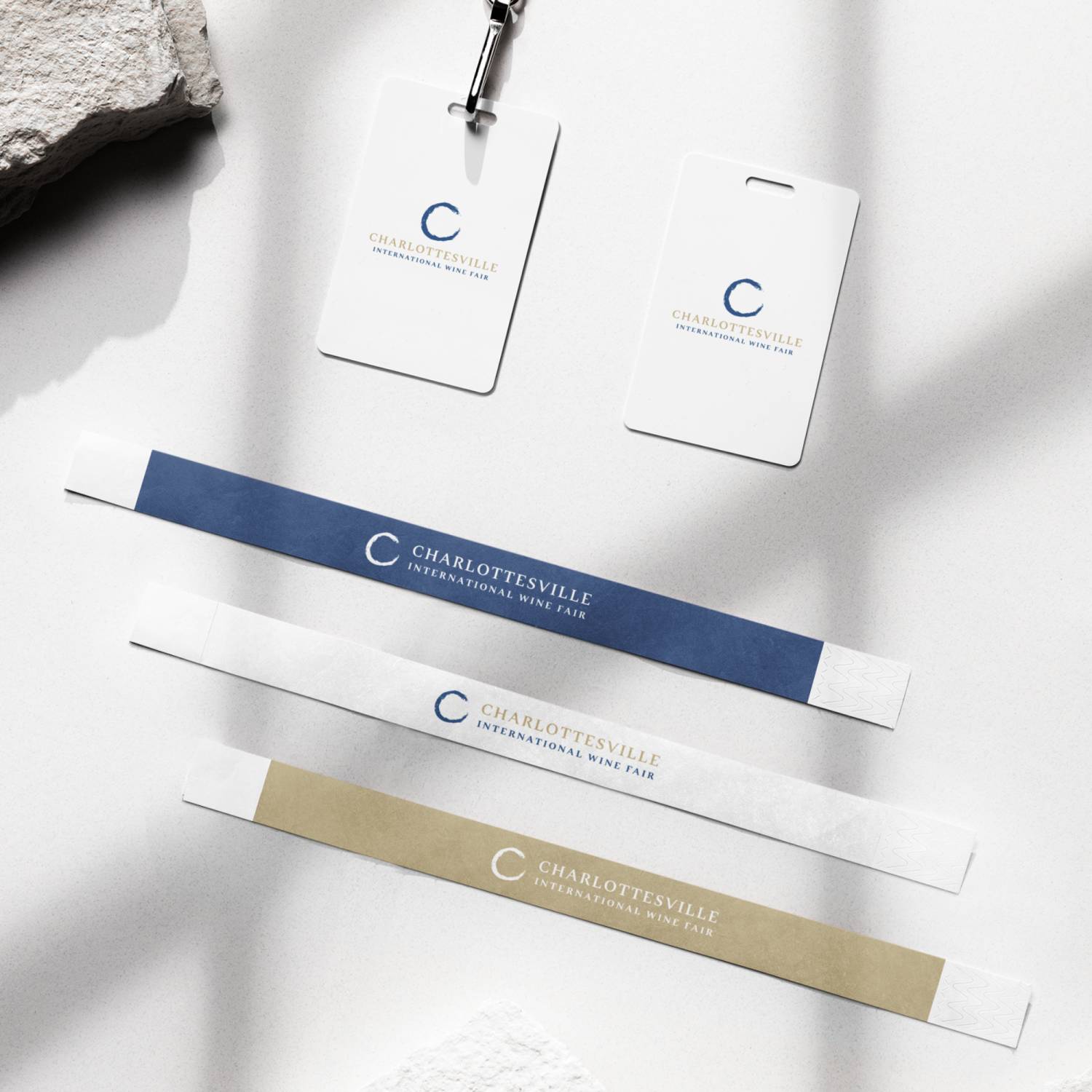
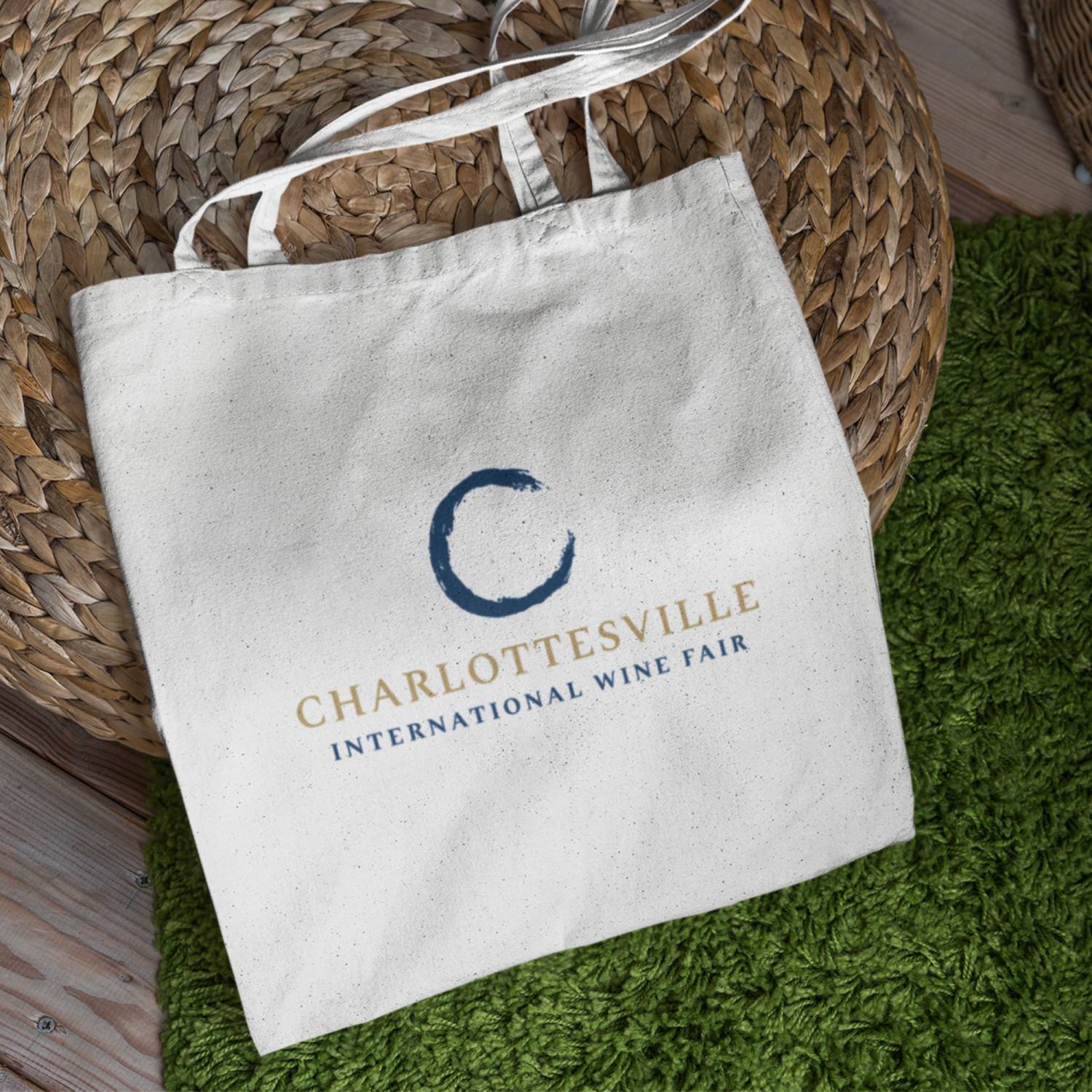
The typography of the event name balances readability with a subtle touch of excellence through intentional customization of certain letterforms. The chosen colors—royal blue and gold—further add to the sophistication the client was after.
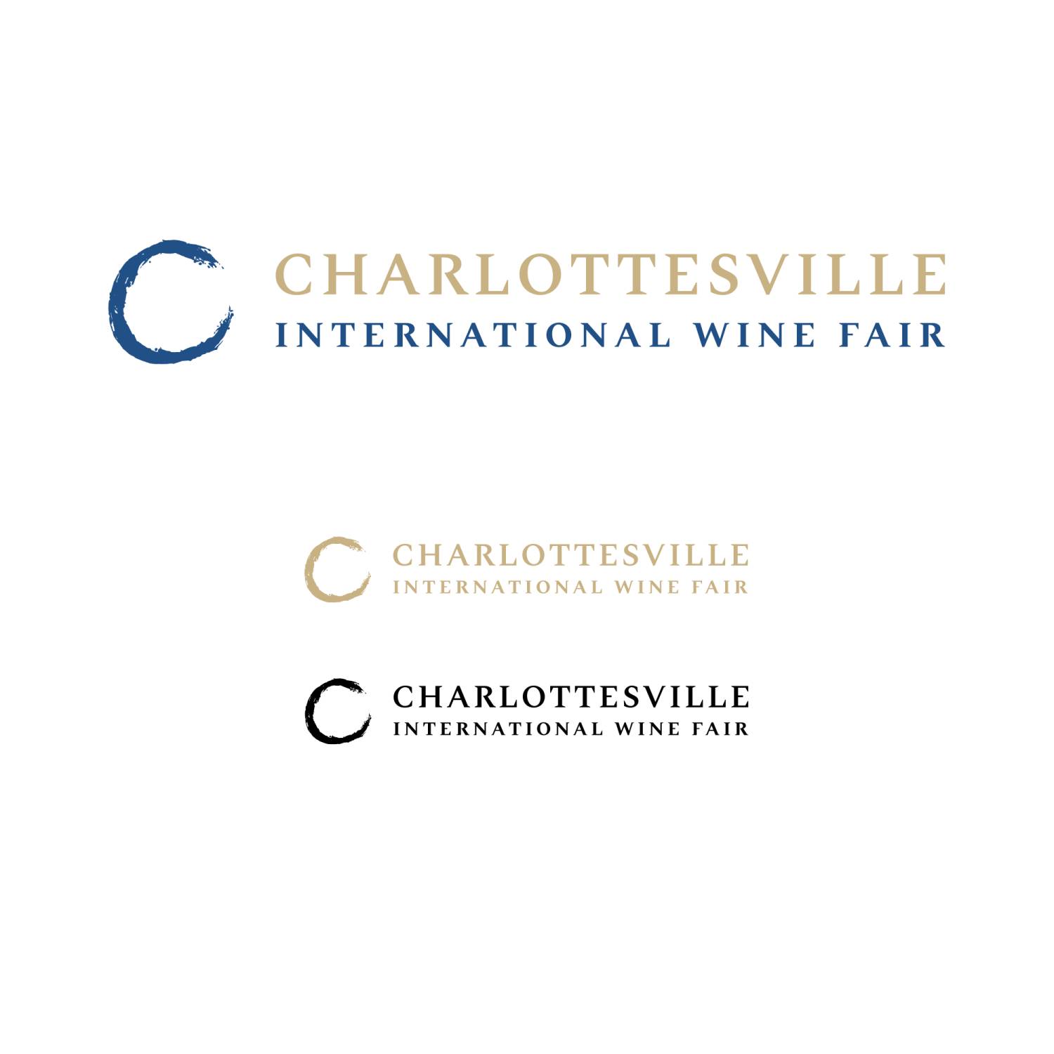
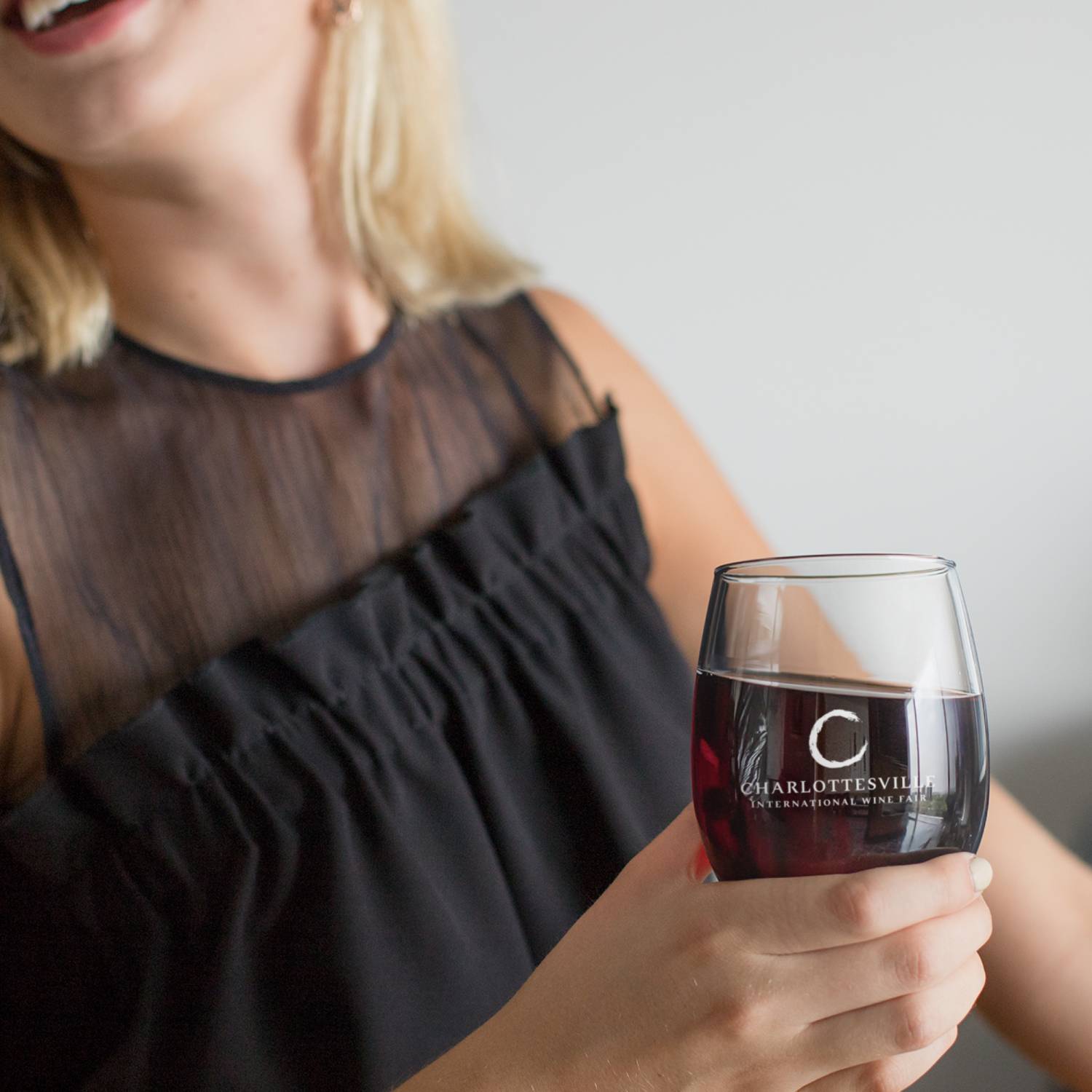
The final deliverables included the primary and secondary lockups, each in various formats for digital and print, and a minimal Logo Guidelines document.
Client Feedback
"Outstanding work! I'm really happy with the brand you created... You have developed a lovely and durable brand identity that will stand the test of time."
