Karani is a donor management and fundraising platform built for nonprofits, ministries, and mission-driven organizations. Their tagline says it well: fundraising should feel inspiring, not exhausting.
When the Karani team reached out, they needed a website that matched that energy: friendly, approachable, even a little whimsical. They had a rough direction in mind and just needed someone to bring it to life.
The Brief
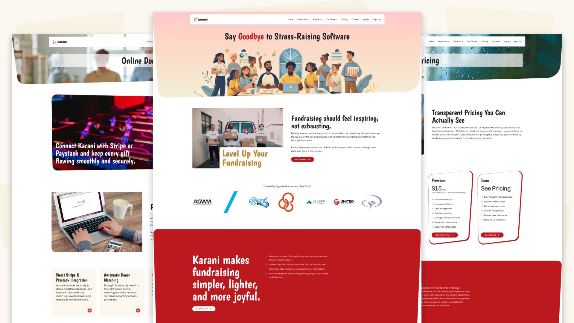
The Karani team came to Block 81 with a clear sense of what they wanted. They were equally clear about what they didn't want. The team identified a set of components from a Shuffle theme that covered the right types of content blocks, but the look and feel was not what they were after. To communicate the vibe they were going for, they sent over an AI-generated illustration that captured it perfectly: warm, fun, and a little playful.
Our job was to deliver a static site built with Jigsaw (a Laravel Blade-based static site generator) and Tailwind CSS, both specifically requested by the Karani team.
Design & Development
Rather than designing full static mockups in advance, we worked directly in the browser. While not always the first choice (or the most appropriate), in this case it proved to be a faster, more iterative approach that works especially well when the goal is to feel your way into a design rather than spec it out upfront.
To make sure all the pieces were accounted for before building out individual pages, we started by creating a single "reference page"—essentially one long page containing every component and content block the site would need. Think of it as a master template: get all the pieces right once, then assemble them as needed.
The whimsical feel called for more than just illustrations. The shapes throughout the design do a lot of work — rounded corners and skewed, parallelogram-style sections that keep things feeling dynamic and a little unexpected. For those oddly angled shapes, I turned to Figma to create the SVG masks that made them possible.
Color-wise, we worked from Karani's existing brand: black and red as the primary palette. To keep things from feeling too stark, a third color was introduced—a warm cream/light sand—that softened the overall tone and supported that light, approachable feel. I used ColorSpace to find colors that played well with Karani's red, then extended the palette from there in Figma.
On the development side, Jigsaw was a tool we'd crossed paths with before but never had the time to fully explore. This project was a great excuse to dig in. Once we could give it proper attention, it came together quickly. And since it's Laravel-based, it uses Blade templating, which felt immediately familiar after years of working with Twig.

Client Feedback
"The site looks INCREDIBLE, and it's a huge thanks to you!"
The finished deliverable sat in the Karani team's hands for a while before they built the site out; that's just the nature of some projects. It went live quietly, and when the feedback came in, it was a good reminder that the best work happens when a client knows their brand's soul and trusts you to translate it.


